© 2017 Jerry D. Patillo

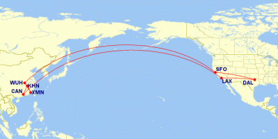
Above is a map of the flights that my wife and I took from and to the U.S. and China in July of 2017.
Have you ever wondered, why are the flight paths curved? Why don’t the pilots fly in a straight line from Point A to Point B?
Well, they actually do fly in a straight line — as much as they can. A straight line is the shortest distance between Point A and Point B. Flying the shortest distance possible saves the airline companies time, fuel, and money. This enables them to pass SOME of the savings onto us, the passengers.
The problem is that you’re looking at a two-dimensional (2D) map that attempts to display three-dimensional (3D) information. I hate to break the news to you, but the earth is round, not flat! 🙂
Whenever you try to display 3D information on a 2D medium such as a paper map or a computer screen, there’s going to be some distortion in the following areas:
- Size (Area)
- Shape
- Distance
- Direction
So the cartographers (mapmakers) have to make a decision: Which ONE of the four geographic attributes above do they want to minimize distortion? Or, is a compromise display of distortion acceptable? Hence the science of cartography and map projections.
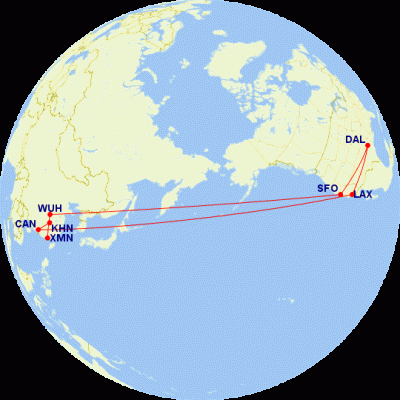
Airline navigators are interested in flying the shortest route possible (a straight line) from one point on the earth to another. So they will use an orthographic map similar to the one below (Fig 2).

You can simulate the same thing by using a globe in your den or the public library. Put a tape measure at Los Angeles (LAX) on the globe. Even a length of string or ribbon will work. Stretch the tape (string, ribbon, etc.) out in a straight line toward Guǎngzhōu (CAN), China, on the opposite side of the globe.
The flight path will not be exactly a straight line, but the navigators will try to get as close as possible to a straight line (the shortest path). They will have to deviate from time to time because of local conditions such as weather, politics (e.g., North Korea), etc.
Fig. 2, above, is an orthographic map projection centered over 57°N 175°E, between the Aleutians, Kamchatka, and NE Russia. The view is directly over the center of the flight paths, as if we were taking a photo of the paths from outer space. This projection does a good job of showing direction, but distorts distance and the size and shape of land masses. It’s not a common map for the lay person (you and me) to look at.
Going from LAX to CAN and back, you will see that the flights pass by :
- The Aleutian Islands of Alaska
- Kamchatka Peninsula of NE Russia
- Northern Japan
- North and South Korea
Now, look at Fig. 1 again. It’s called a plate carrée (“plaht kuh ‘rei “) or equidistant rectangular map projection. It looks a lot more like what we’re accustomed to seeing, but it’s still a distorted representation of the round earth. It does a good job of representing distance, but distorts direction, shape, and size.
This projection is centered over 29°N 175°E, NW of the Hawaiian Islands. This is about the same latitude (distance from the equator) as Galveston, TX, and Orlando, FL.
In the two maps above, we’re looking at exactly the same flights. They’re both passing by the Aleutians, Kamchatka, Japan, and the Koreas. Both maps are showing the shortest straight-line paths possible.
It’s just that the points of view of a round earth are different.
Resources
http://www.gcmap.com/.
https://www.greatcirclemapper.net/
https://en.wikipedia.org/wiki/List_of_map_projections
http://www.radicalcartography.net/?projectionref
The Hammond Universal World Atlas. Maplewood, NJ: Hammond, Incorporated, 1989.
The maps above were generated by http://www.gcmap.com/.